출처 - http://blog.naver.com/pistolcaffe/221010983726
이번 글은 ConstraintLayout 에 대한 분석 내용입니다.
ConstraintLayout 은 지난 2016 년 개최 되었던 Google I/O 에 공개 된 레이아웃 에디터에 상호연관 시키기 위해 도입 된 Layout 입니다.
언뜻보면 RelativeLayout 과 비슷해보이기도 하는데, ConstraintLayout 만의 강력한 기능으로 좀 더 유연하고 빠른 레이아웃을 구성할 수 있습니다.
레이아웃 에디터를 이용하면 ConstraintLayout 안의 widget 간의 관계를 쉽게 파악할 수 있으므로 좀더 편리한 UI 작업을 할 수 있습니다.
그러나 기존의 XML 만 이용하여 UI 작업을 하셨던 분들도 충분히 ConstraintLayout 에 익숙해 질 수 있습니다.
ConstraintLayout 의 특성에 대해 알아보고, RelativeLayout 과 혼동 될 수 있는 부분에 대해서는 비교를 통해 그 차이점을 알아보도록 하겠습니다.
그럼 ConstraintLayout 의 주요 특성에 대해 알아 보도록 하겠습니다.
본 포스팅은 아래 링크의 내용을 참고하여 구성되었습니다.
(https://developer.android.com/reference/android/support/constraint/ConstraintLayout.html)
(https://news.realm.io/kr/news/constraintlayout-it-can-do-what-now)
app:layout_constraintBaseline_toBaselineOf="@id/target"
app:layout_constraintBottom_toBottomOf="@id/target"
app:layout_constraintBottom_toTopOf="@id/target"
app:layout_constraintEnd_toEndOf="@id/target"
app:layout_constraintEnd_toStartOf="@id/target"
app:layout_constraintLeft_toLeftOf="@id/target"
app:layout_constraintLeft_toRightOf="@id/target"
app:layout_constraintRight_toLeftOf="@id/target"
app:layout_constraintRight_toRightOf="@id/target"
app:layout_constraintStart_toEndOf="@id/target"
app:layout_constraintStart_toStartOf="@id/target"
app:layout_constraintTop_toBottomOf="@id/target"
app:layout_constraintTop_toTopOf="@id/target"
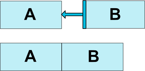
app:layout_constraintLeft_toRightOf="@id/btnA"
app:layout_constraintTop_toBottomOf="@id/btnA"
app:layout_constraintTop_toBottomOf="parent"
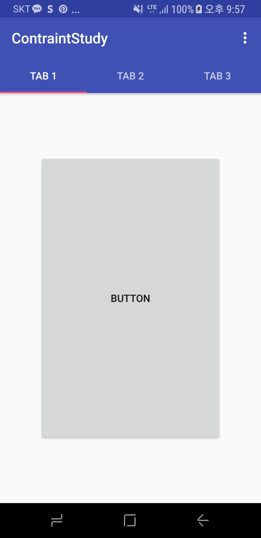
<Button
    android:id="@+id/btnB"
    android:layout_width="wrap_content"
    android:layout_height="wrap_content"
    android:layout_marginLeft="30dp"
    app:layout_constraintLeft_toRightOf="@id/btnA"/>
<?xml version="1.0" encoding="utf-8"?>
<android.support.constraint.ConstraintLayout xmlns:android="http://schemas.android.com/apk/res/android"
xmlns:app="http://schemas.android.com/apk/res-auto"
android:layout_width="match_parent"
android:layout_height="match_parent">
<Button
android:id="@+id/btnB"
android:layout_width="wrap_content"
android:layout_height="wrap_content"
android:gravity="center"
android:padding="5dp"
android:text="ConstraintLayout"
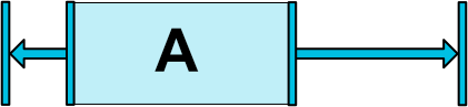
app:layout_constraintLeft_toLeftOf="parent"
app:layout_constraintRight_toRightOf="parent" />
</android.support.constraint.ConstraintLayout>
app:layout_constraintLeft_toLeftOf="parent"
app:layout_constraintRight_toRightOf="parent"

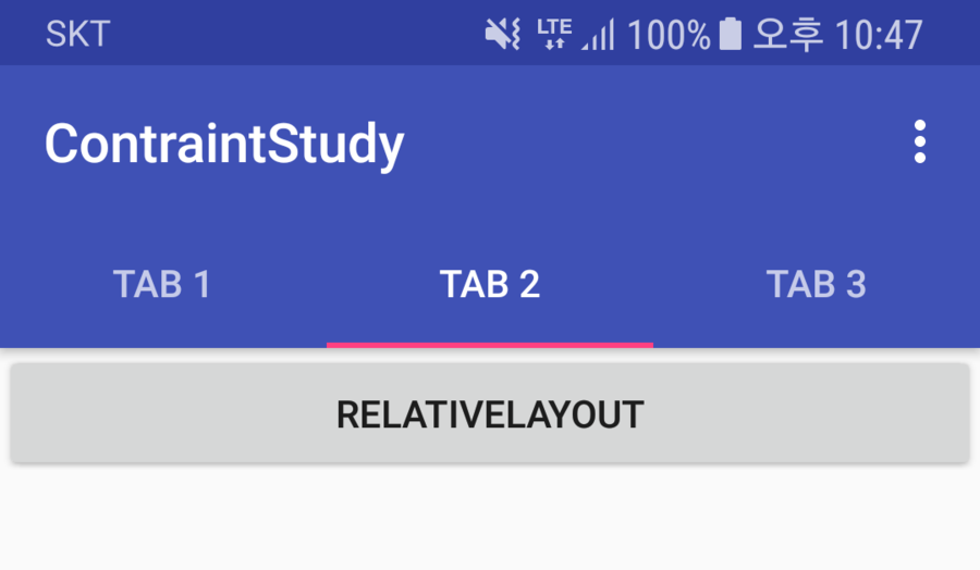
<RelativeLayout xmlns:android="http://schemas.android.com/apk/res/android"
    android:layout_width="match_parent"
    android:layout_height="match_parent">

    <Button
        android:layout_width="wrap_content"
        android:layout_height="wrap_content"
        android:layout_alignParentLeft="true"
        android:layout_alignParentRight="true"
        android:gravity="center"
        android:padding="5dp"
        android:text="RelativeLayout" />

</RelativeLayout>
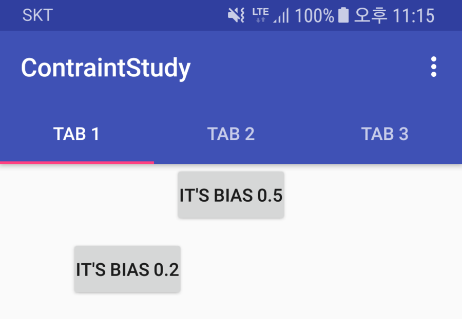
app:layout_constraintHorizontal_bias="0.5"
app:layout_constraintVertical_bias="0.5"
<?xml version="1.0" encoding="utf-8"?>
<android.support.constraint.ConstraintLayout xmlns:android="http://schemas.android.com/apk/res/android"
    xmlns:app="http://schemas.android.com/apk/res-auto"
    android:layout_width="match_parent"
    android:layout_height="match_parent">

    <Button
        android:id="@+id/btnA"
        android:layout_width="wrap_content"
        android:layout_height="wrap_content"
        android:gravity="center"
        android:padding="5dp"
        android:text="It's bias 0.5"
        app:layout_constraintHorizontal_bias="0.5"
        app:layout_constraintLeft_toLeftOf="parent"
        app:layout_constraintRight_toRightOf="parent" />

    <Button
        android:id="@+id/btnB"
        android:layout_width="wrap_content"
        android:layout_height="wrap_content"
        android:layout_marginTop="10dp"
        android:gravity="center"
        android:padding="5dp"
        android:text="It's bias 0.2"
        app:layout_constraintHorizontal_bias="0.2"
        app:layout_constraintLeft_toLeftOf="parent"
        app:layout_constraintRight_toRightOf="parent"
        app:layout_constraintTop_toBottomOf="@id/btnA" />

</android.support.constraint.ConstraintLayout>
<?xml version="1.0" encoding="utf-8"?>
<android.support.constraint.ConstraintLayout xmlns:android="http://schemas.android.com/apk/res/android"
xmlns:app="http://schemas.android.com/apk/res-auto"
android:layout_width="match_parent"
android:layout_height="match_parent">
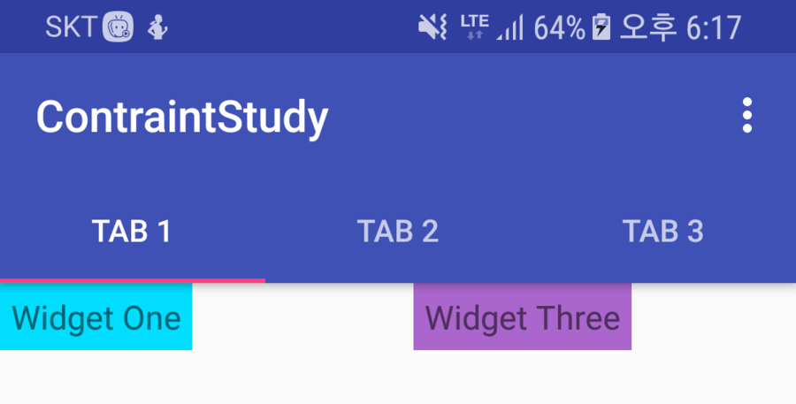
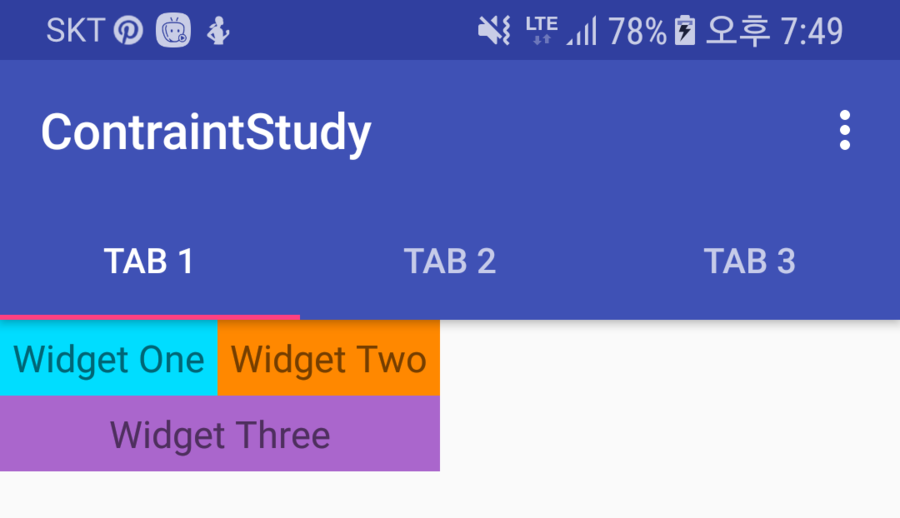
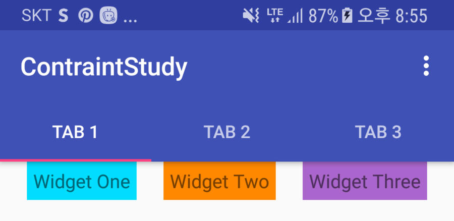
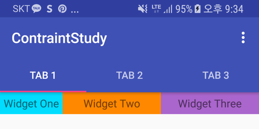
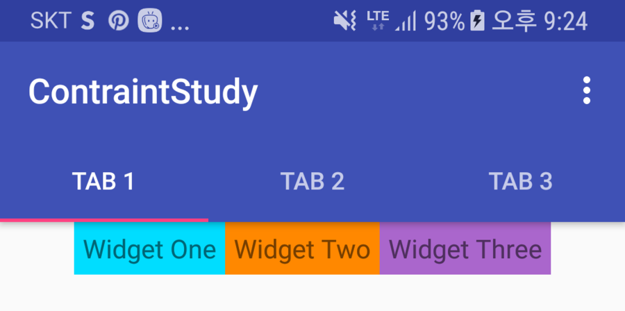
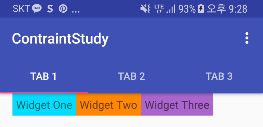
<TextView
android:id="@+id/w_A"
android:layout_width="wrap_content"
android:layout_height="wrap_content"
android:background="@android:color/holo_blue_bright"
android:gravity="center"
android:padding="5dp"
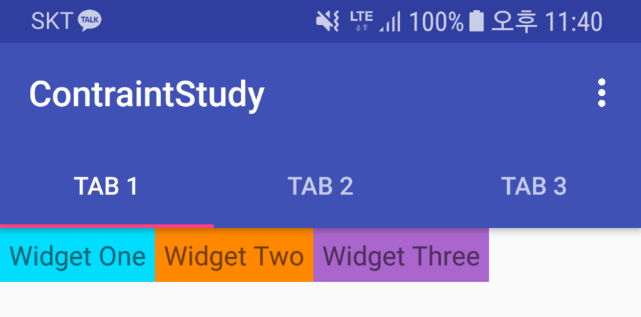
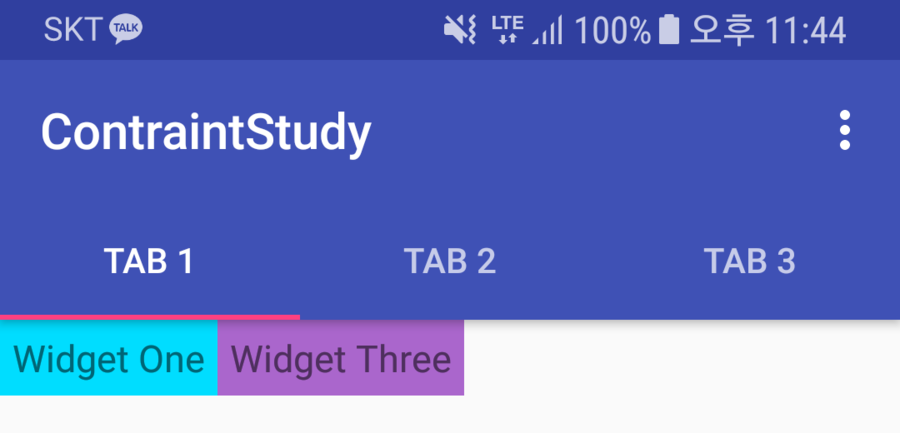
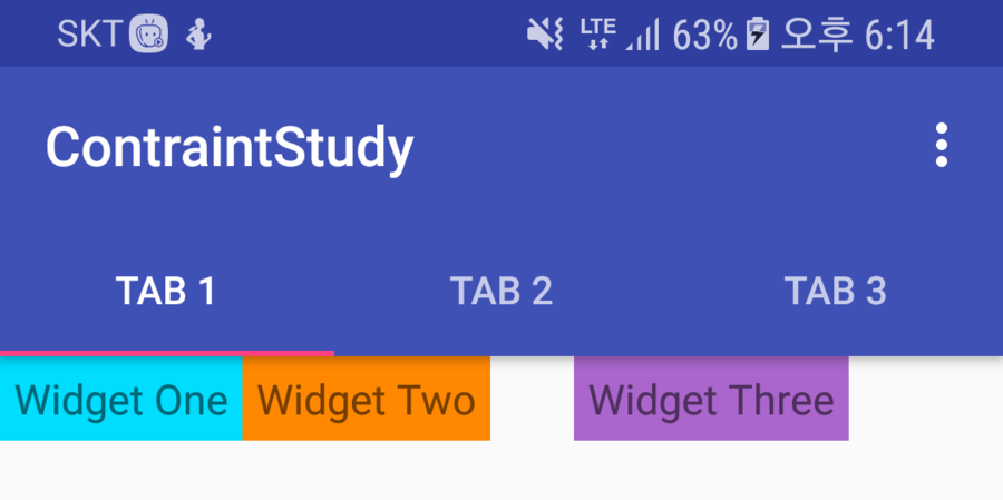
android:text="Widget One"
android:textSize="15sp"
app:layout_constraintLeft_toLeftOf="parent" />
<TextView
android:id="@+id/w_B"
android:layout_width="wrap_content"
android:layout_height="wrap_content"
android:background="@android:color/holo_orange_dark"
android:gravity="center"
android:padding="5dp"
android:text="Widget Two"
android:textSize="15sp"
app:layout_constraintLeft_toRightOf="@id/w_A" />
<TextView
android:id="@+id/w_C"
android:layout_width="wrap_content"
android:layout_height="wrap_content"
android:background="@android:color/holo_purple"
android:gravity="center"
android:padding="5dp"
android:text="Widget Three"
android:textSize="15sp"
app:layout_constraintLeft_toRightOf="@id/w_B" />
</android.support.constraint.ConstraintLayout>
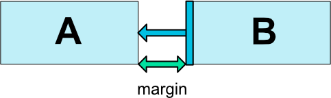
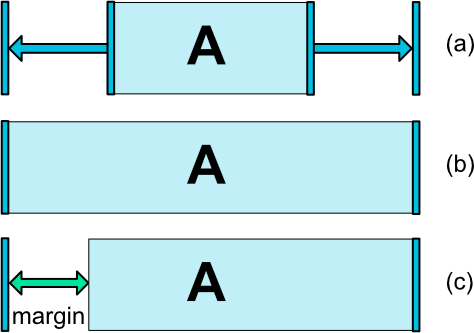
app:layout_goneMarginLeft=""
app:layout_goneMarginBottom=""
app:layout_goneMarginEnd=""
app:layout_goneMarginRight=""
app:layout_goneMarginStart=""
app:layout_goneMarginTop=""
<?xml version="1.0" encoding="utf-8"?>
<android.support.constraint.ConstraintLayout xmlns:android="http://schemas.android.com/apk/res/android"
xmlns:app="http://schemas.android.com/apk/res-auto"
android:layout_width="match_parent"
android:layout_height="match_parent">
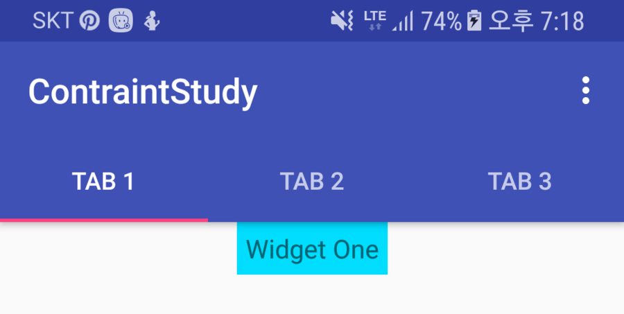
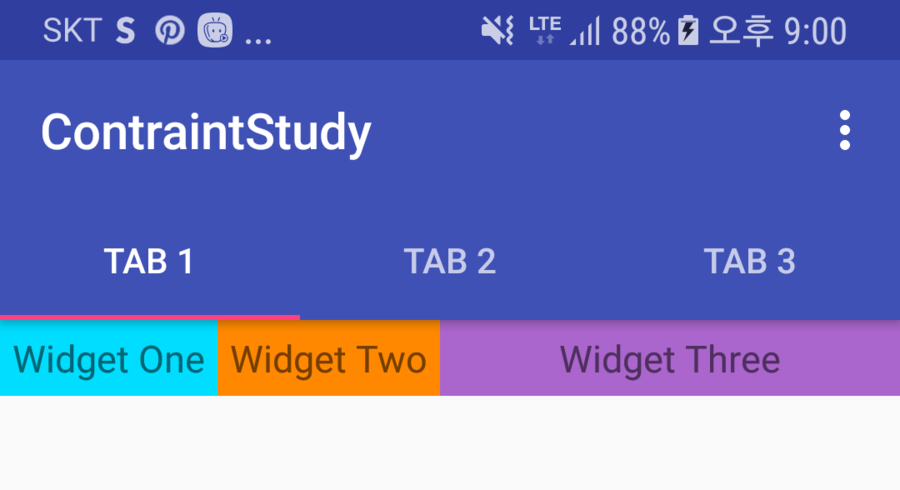
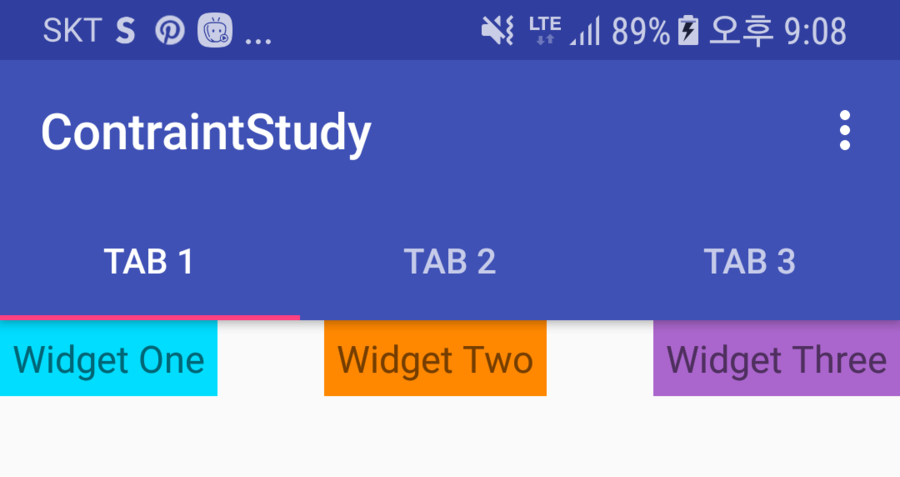
<TextView
android:id="@+id/w_A"
android:layout_width="wrap_content"
android:layout_height="wrap_content"
android:background="@android:color/holo_blue_bright"
android:gravity="center"
android:padding="5dp"
android:text="Widget One"
android:textSize="15sp"
app:layout_constraintLeft_toLeftOf="parent" />
<TextView
android:id="@+id/w_B"
android:layout_width="wrap_content"
android:layout_height="wrap_content"
android:background="@android:color/holo_orange_dark"
android:gravity="center"
android:padding="5dp"
android:text="Widget Two"
android:textSize="15sp"
app:layout_constraintLeft_toRightOf="@id/w_A" />
<TextView
android:id="@+id/w_C"
android:layout_width="wrap_content"
android:layout_height="wrap_content"
android:layout_marginLeft="30dp"
android:background="@android:color/holo_purple"
android:gravity="center"
android:padding="5dp"
android:text="Widget Three"
android:textSize="15sp"
app:layout_constraintLeft_toRightOf="@id/w_B"
app:layout_goneMarginLeft="100dp" />
</android.support.constraint.ConstraintLayout>
android:layout_width="0dp"
<?xml version="1.0" encoding="utf-8"?>
<android.support.constraint.ConstraintLayout xmlns:android="http://schemas.android.com/apk/res/android"
    xmlns:app="http://schemas.android.com/apk/res-auto"
    android:layout_width="match_parent"
    android:layout_height="match_parent">

    <TextView
        android:id="@+id/w_A"
        android:layout_width="wrap_content"
        android:layout_height="wrap_content"
        android:background="@android:color/holo_blue_bright"
        android:gravity="center"
        app:layout_constraintRight_toRightOf="parent"
        app:layout_constraintLeft_toLeftOf="parent"
        android:padding="5dp"
        android:text="Widget One"
        android:textSize="15sp" />

</android.support.constraint.ConstraintLayout>
<?xml version="1.0" encoding="utf-8"?>
<android.support.constraint.ConstraintLayout xmlns:android="http://schemas.android.com/apk/res/android"
    xmlns:app="http://schemas.android.com/apk/res-auto"
    android:layout_width="match_parent"
    android:layout_height="match_parent">

    <TextView
        android:id="@+id/w_A"
        android:layout_width="0dp"
        android:layout_height="wrap_content"
        android:background="@android:color/holo_blue_bright"
        android:gravity="center"
        app:layout_constraintRight_toRightOf="parent"
        app:layout_constraintLeft_toLeftOf="parent"
        android:padding="5dp"
        android:text="Widget One"
        android:textSize="15sp" />

</android.support.constraint.ConstraintLayout>
<TextView
    android:id="@+id/w_A"
    android:layout_width="0dp"
    android:layout_height="wrap_content"
    android:background="@android:color/holo_blue_bright"
    android:gravity="center"
    android:layout_marginLeft="100dp"
    app:layout_constraintLeft_toLeftOf="parent"
    app:layout_constraintRight_toRightOf="parent"
    android:padding="5dp"
    android:text="Widget One"
    android:textSize="15sp" />
<?xml version="1.0" encoding="utf-8"?>
<android.support.constraint.ConstraintLayout xmlns:android="http://schemas.android.com/apk/res/android"
    xmlns:app="http://schemas.android.com/apk/res-auto"
    android:layout_width="match_parent"
    android:layout_height="match_parent">

    <TextView
        android:id="@+id/w_A"
        android:layout_width="wrap_content"
        android:layout_height="wrap_content"
        android:background="@android:color/holo_blue_bright"
        android:gravity="center"
        android:padding="5dp"
        android:text="Widget One"
        android:textSize="15sp" />

    <TextView
        android:id="@+id/w_B"
        android:layout_width="wrap_content"
        android:layout_height="wrap_content"
        android:background="@android:color/holo_orange_dark"
        android:gravity="center"
        android:padding="5dp"
        android:text="Widget Two"
        android:textSize="15sp"
        app:layout_constraintLeft_toRightOf="@id/w_A" />

    <TextView
        android:id="@+id/w_C"
        android:layout_width="0dp"
        android:layout_height="wrap_content"
        android:background="@android:color/holo_purple"
        android:gravity="center"
        android:padding="5dp"
        android:text="Widget Three"
        android:textSize="15sp"
        app:layout_constraintLeft_toLeftOf="@id/w_A"
        app:layout_constraintRight_toRightOf="@id/w_B"
        app:layout_constraintTop_toBottomOf="@id/w_A" />

</android.support.constraint.ConstraintLayout>
<TextView
    android:id="@+id/w_A"
    android:layout_width="wrap_content"
    android:layout_height="0dp"
    android:background="@android:color/holo_blue_bright"
    android:gravity="center"
    android:padding="5dp"
    android:text="Widget One"
    android:textSize="15sp"
    app:layout_constraintLeft_toLeftOf="parent"
    app:layout_constraintDimensionRatio="1:1" />
<TextView
    android:id="@+id/w_A"
    android:layout_width="0dp"
    android:layout_height="0dp"
    android:background="@android:color/holo_blue_bright"
    android:gravity="center"
    android:padding="5dp"
    android:text="16:9"
    android:textSize="15sp"
    app:layout_constraintTop_toTopOf="parent"
    app:layout_constraintBottom_toBottomOf="parent"
    app:layout_constraintDimensionRatio="h,16:9" />
app:layout_constraintDimensionRatio="h 혹은 w, width:height"
<TextView
    android:id="@+id/w_A"
    android:layout_width="wrap_content"
    android:layout_height="wrap_content"
    android:background="@android:color/holo_blue_bright"
    android:gravity="center"
    android:padding="5dp"
    android:text="Widget One"
    android:textSize="15sp"
    app:layout_constraintLeft_toLeftOf="parent"
    app:layout_constraintRight_toLeftOf="@+id/w_B" />

<TextView
    android:id="@+id/w_B"
    android:layout_width="wrap_content"
    android:layout_height="wrap_content"
    android:background="@android:color/holo_orange_dark"
    android:gravity="center"
    android:padding="5dp"
    android:text="Widget Two"
    android:textSize="15sp"
    app:layout_constraintLeft_toRightOf="@id/w_A"
    app:layout_constraintRight_toRightOf="parent" />
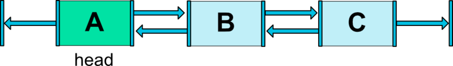
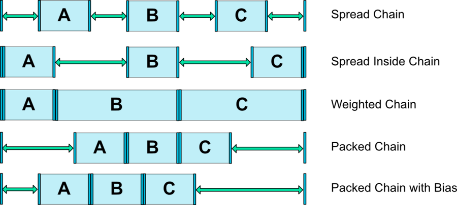
CHAIN_SPREAD-- the elements will be spread out (default style)
<TextView
    android:id="@+id/w_A"
    android:layout_width="wrap_content"
    android:layout_height="wrap_content"
    android:background="@android:color/holo_blue_bright"
    android:gravity="center"
    android:padding="5dp"
    android:text="Widget One"
    android:textSize="15sp"
    app:layout_constraintLeft_toLeftOf="parent"
    app:layout_constraintRight_toLeftOf="@+id/w_B" />

<TextView
    android:id="@+id/w_B"
    android:layout_width="wrap_content"
    android:layout_height="wrap_content"
    android:background="@android:color/holo_orange_dark"
    android:gravity="center"
    android:padding="5dp"
    android:text="Widget Two"
    android:textSize="15sp"
    app:layout_constraintLeft_toRightOf="@id/w_A"
    app:layout_constraintRight_toLeftOf="@+id/w_C" />

<TextView
    android:id="@+id/w_C"
    android:layout_width="wrap_content"
    android:layout_height="wrap_content"
    android:background="@android:color/holo_purple"
    android:gravity="center"
    android:padding="5dp"
    android:text="Widget Three"
    android:textSize="15sp"
    app:layout_constraintLeft_toRightOf="@id/w_B"
    app:layout_constraintRight_toRightOf="parent" />
- Weighted chain -- in
CHAIN_SPREADmode, if some widgets are set toMATCH_CONSTRAINT, they will split the available space
app:layout_constraintHorizontal_weight="1"
<?xml version="1.0" encoding="utf-8"?>
<android.support.constraint.ConstraintLayout xmlns:android="http://schemas.android.com/apk/res/android"
    xmlns:app="http://schemas.android.com/apk/res-auto"
    android:layout_width="match_parent"
    android:layout_height="match_parent">

    <TextView
        android:id="@+id/w_A"
        android:layout_width="wrap_content"
        android:layout_height="wrap_content"
        android:background="@android:color/holo_blue_bright"
        android:gravity="center"
        android:padding="5dp"
        android:text="Widget One"
        android:textSize="15sp"
        app:layout_constraintLeft_toLeftOf="parent"
        app:layout_constraintRight_toLeftOf="@+id/w_B" />

    <TextView
        android:id="@+id/w_B"
        android:layout_width="0dp"
        android:layout_height="wrap_content"
        android:background="@android:color/holo_orange_dark"
        android:gravity="center"
        android:padding="5dp"
        android:text="Widget Two"
        android:textSize="15sp"
        app:layout_constraintHorizontal_weight="1"
        app:layout_constraintLeft_toRightOf="@id/w_A"
        app:layout_constraintRight_toLeftOf="@+id/w_C" />

    <TextView
        android:id="@+id/w_C"
        android:layout_width="0dp"
        android:layout_height="wrap_content"
        android:background="@android:color/holo_purple"
        android:gravity="center"
        android:padding="5dp"
        android:text="Widget Three"
        android:textSize="15sp"
        app:layout_constraintHorizontal_weight="1"
        app:layout_constraintLeft_toRightOf="@id/w_B"
        app:layout_constraintRight_toRightOf="parent" />

</android.support.constraint.ConstraintLayout>
CHAIN_SPREAD_INSIDE-- similar, but the endpoints of the chain will not be spread out
app:layout_constraintHorizontal_chainStyle=""
app:layout_constraintVertical_chainStyle=""
<TextView
    android:id="@+id/w_A"
    android:layout_width="wrap_content"
    android:layout_height="wrap_content"
    android:background="@android:color/holo_blue_bright"
    android:gravity="center"
    android:padding="5dp"
    android:text="Widget One"
    android:textSize="15sp"
    app:layout_constraintHorizontal_chainStyle="spread_inside"
    app:layout_constraintLeft_toLeftOf="parent"
    app:layout_constraintRight_toLeftOf="@+id/w_B" />
CHAIN_PACKED-- the elements of the chain will be packed together. The horizontal or vertical bias attribute of the child will then affect the positioning of the packed elements
<TextView
    android:id="@+id/w_A"
    android:layout_width="wrap_content"
    android:layout_height="wrap_content"
    android:background="@android:color/holo_blue_bright"
    android:gravity="center"
    android:padding="5dp"
    android:text="Widget One"
    android:textSize="15sp"
    app:layout_constraintHorizontal_chainStyle="packed"
    app:layout_constraintLeft_toLeftOf="parent"
    app:layout_constraintRight_toLeftOf="@+id/w_B" />
<TextView
    android:id="@+id/w_A"
    android:layout_width="wrap_content"
    android:layout_height="wrap_content"
    android:background="@android:color/holo_blue_bright"
    android:gravity="center"
    android:padding="5dp"
    android:text="Widget One"
    android:textSize="15sp"
    app:layout_constraintHorizontal_chainStyle="packed"
    app:layout_constraintHorizontal_bias="0.2"
    app:layout_constraintLeft_toLeftOf="parent"
    app:layout_constraintRight_toLeftOf="@+id/w_B" />
<android.support.constraint.Guideline
    android:id="@+id/guideline1"
    android:layout_width="wrap_content"
    android:layout_height="wrap_content"
    app:layout_constraintGuide_percent=".15" />
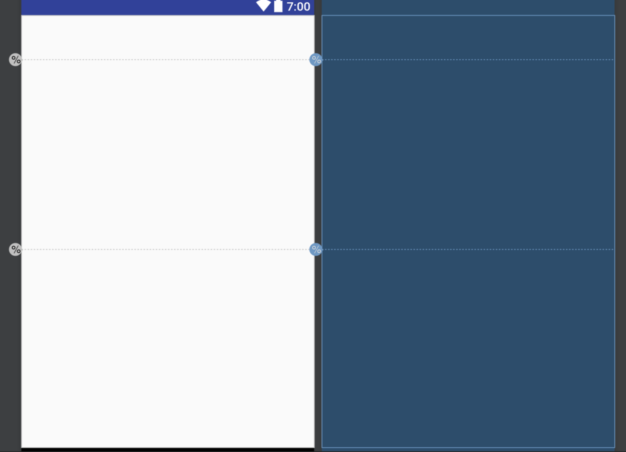
<android.support.constraint.Guideline
    android:id="@+id/left_guideline"
    android:layout_width="wrap_content"
    android:layout_height="wrap_content"
    android:orientation="vertical"
    app:layout_constraintGuide_percent=".15" />

<android.support.constraint.Guideline
    android:id="@+id/right_guideline"
    android:layout_width="wrap_content"
    android:layout_height="wrap_content"
    android:orientation="vertical"
    app:layout_constraintGuide_percent=".85" />

<android.support.constraint.Guideline
    android:id="@+id/top_guideline"
    android:layout_width="wrap_content"
    android:layout_height="wrap_content"
    android:orientation="horizontal"
    app:layout_constraintGuide_percent=".15" />

<android.support.constraint.Guideline
    android:id="@+id/bottom_guideline"
    android:layout_width="wrap_content"
    android:layout_height="wrap_content"
    android:orientation="horizontal"
    app:layout_constraintGuide_percent=".85" />

<Button
    android:id="@+id/button"
    android:layout_width="0dp"
    android:layout_height="0dp"
    android:text="Button"
    app:layout_constraintBottom_toBottomOf="@+id/bottom_guideline"
    app:layout_constraintLeft_toLeftOf="@+id/left_guideline"
    app:layout_constraintRight_toRightOf="@+id/right_guideline"
    app:layout_constraintTop_toTopOf="@+id/top_guideline" />

[출처] Android ConstraintLayout 분석|작성자 pistolcaffe
이번 글은 ConstraintLayout 에 대한 분석 내용입니다.
ConstraintLayout 은 지난 2016 년 개최 되었던 Google I/O 에 공개 된 레이아웃 에디터에 상호연관 시키기 위해 도입 된 Layout 입니다.
언뜻보면 RelativeLayout 과 비슷해보이기도 하는데, ConstraintLayout 만의 강력한 기능으로 좀 더 유연하고 빠른 레이아웃을 구성할 수 있습니다.
레이아웃 에디터를 이용하면 ConstraintLayout 안의 widget 간의 관계를 쉽게 파악할 수 있으므로 좀더 편리한 UI 작업을 할 수 있습니다.
그러나 기존의 XML 만 이용하여 UI 작업을 하셨던 분들도 충분히 ConstraintLayout 에 익숙해 질 수 있습니다.
ConstraintLayout 의 특성에 대해 알아보고, RelativeLayout 과 혼동 될 수 있는 부분에 대해서는 비교를 통해 그 차이점을 알아보도록 하겠습니다.
그럼 ConstraintLayout 의 주요 특성에 대해 알아 보도록 하겠습니다.
본 포스팅은 아래 링크의 내용을 참고하여 구성되었습니다.
(https://developer.android.com/reference/android/support/constraint/ConstraintLayout.html)
(https://news.realm.io/kr/news/constraintlayout-it-can-do-what-now)
app:layout_constraintBaseline_toBaselineOf="@id/target"
app:layout_constraintBottom_toBottomOf="@id/target"
app:layout_constraintBottom_toTopOf="@id/target"
app:layout_constraintEnd_toEndOf="@id/target"
app:layout_constraintEnd_toStartOf="@id/target"
app:layout_constraintLeft_toLeftOf="@id/target"
app:layout_constraintLeft_toRightOf="@id/target"
app:layout_constraintRight_toLeftOf="@id/target"
app:layout_constraintRight_toRightOf="@id/target"
app:layout_constraintStart_toEndOf="@id/target"
app:layout_constraintStart_toStartOf="@id/target"
app:layout_constraintTop_toBottomOf="@id/target"
app:layout_constraintTop_toTopOf="@id/target"
app:layout_constraintLeft_toRightOf="@id/btnA"
app:layout_constraintTop_toBottomOf="@id/btnA"
app:layout_constraintTop_toBottomOf="parent"
<Button
    android:id="@+id/btnB"
    android:layout_width="wrap_content"
    android:layout_height="wrap_content"
    android:layout_marginLeft="30dp"
    app:layout_constraintLeft_toRightOf="@id/btnA"/>
<?xml version="1.0" encoding="utf-8"?>
<android.support.constraint.ConstraintLayout xmlns:android="http://schemas.android.com/apk/res/android"
    xmlns:app="http://schemas.android.com/apk/res-auto"
    android:layout_width="match_parent"
    android:layout_height="match_parent">

    <Button
        android:id="@+id/btnB"
        android:layout_width="wrap_content"
        android:layout_height="wrap_content"
        android:gravity="center"
        android:padding="5dp"
        android:text="ConstraintLayout"
        app:layout_constraintLeft_toLeftOf="parent"
        app:layout_constraintRight_toRightOf="parent" />

</android.support.constraint.ConstraintLayout>
app:layout_constraintLeft_toLeftOf="parent"
app:layout_constraintRight_toRightOf="parent"
<RelativeLayout xmlns:android="http://schemas.android.com/apk/res/android"
    android:layout_width="match_parent"
    android:layout_height="match_parent">

    <Button
        android:layout_width="wrap_content"
        android:layout_height="wrap_content"
        android:layout_alignParentLeft="true"
        android:layout_alignParentRight="true"
        android:gravity="center"
        android:padding="5dp"
        android:text="RelativeLayout" />

</RelativeLayout>
app:layout_constraintHorizontal_bias="0.5"
app:layout_constraintVertical_bias="0.5"
<?xml version="1.0" encoding="utf-8"?>
<android.support.constraint.ConstraintLayout xmlns:android="http://schemas.android.com/apk/res/android"
    xmlns:app="http://schemas.android.com/apk/res-auto"
    android:layout_width="match_parent"
    android:layout_height="match_parent">

    <Button
        android:id="@+id/btnA"
        android:layout_width="wrap_content"
        android:layout_height="wrap_content"
        android:gravity="center"
        android:padding="5dp"
        android:text="It's bias 0.5"
        app:layout_constraintHorizontal_bias="0.5"
        app:layout_constraintLeft_toLeftOf="parent"
        app:layout_constraintRight_toRightOf="parent" />

    <Button
        android:id="@+id/btnB"
        android:layout_width="wrap_content"
        android:layout_height="wrap_content"
        android:layout_marginTop="10dp"
        android:gravity="center"
        android:padding="5dp"
        android:text="It's bias 0.2"
        app:layout_constraintHorizontal_bias="0.2"
        app:layout_constraintLeft_toLeftOf="parent"
        app:layout_constraintRight_toRightOf="parent"
        app:layout_constraintTop_toBottomOf="@id/btnA" />

</android.support.constraint.ConstraintLayout>
<?xml version="1.0" encoding="utf-8"?>
<android.support.constraint.ConstraintLayout xmlns:android="http://schemas.android.com/apk/res/android"
    xmlns:app="http://schemas.android.com/apk/res-auto"
    android:layout_width="match_parent"
    android:layout_height="match_parent">

    <TextView
        android:id="@+id/w_A"
        android:layout_width="wrap_content"
        android:layout_height="wrap_content"
        android:background="@android:color/holo_blue_bright"
        android:gravity="center"
        android:padding="5dp"
        android:text="Widget One"
        android:textSize="15sp"
        app:layout_constraintLeft_toLeftOf="parent" />

    <TextView
        android:id="@+id/w_B"
        android:layout_width="wrap_content"
        android:layout_height="wrap_content"
        android:background="@android:color/holo_orange_dark"
        android:gravity="center"
        android:padding="5dp"
        android:text="Widget Two"
        android:textSize="15sp"
        app:layout_constraintLeft_toRightOf="@id/w_A" />

    <TextView
        android:id="@+id/w_C"
        android:layout_width="wrap_content"
        android:layout_height="wrap_content"
        android:background="@android:color/holo_purple"
        android:gravity="center"
        android:padding="5dp"
        android:text="Widget Three"
        android:textSize="15sp"
        app:layout_constraintLeft_toRightOf="@id/w_B" />
</android.support.constraint.ConstraintLayout>
app:layout_goneMarginLeft=""
app:layout_goneMarginBottom=""
app:layout_goneMarginEnd=""
app:layout_goneMarginRight=""
app:layout_goneMarginStart=""
app:layout_goneMarginTop=""
<?xml version="1.0" encoding="utf-8"?>
<android.support.constraint.ConstraintLayout xmlns:android="http://schemas.android.com/apk/res/android"
    xmlns:app="http://schemas.android.com/apk/res-auto"
    android:layout_width="match_parent"
    android:layout_height="match_parent">

    <TextView
        android:id="@+id/w_A"
        android:layout_width="wrap_content"
        android:layout_height="wrap_content"
        android:background="@android:color/holo_blue_bright"
        android:gravity="center"
        android:padding="5dp"
        android:text="Widget One"
        android:textSize="15sp"
        app:layout_constraintLeft_toLeftOf="parent" />

    <TextView
        android:id="@+id/w_B"
        android:layout_width="wrap_content"
        android:layout_height="wrap_content"
        android:background="@android:color/holo_orange_dark"
        android:gravity="center"
        android:padding="5dp"
        android:text="Widget Two"
        android:textSize="15sp"
        app:layout_constraintLeft_toRightOf="@id/w_A" />

    <TextView
        android:id="@+id/w_C"
        android:layout_width="wrap_content"
        android:layout_height="wrap_content"
        android:layout_marginLeft="30dp"
        android:background="@android:color/holo_purple"
        android:gravity="center"
        android:padding="5dp"
        android:text="Widget Three"
        android:textSize="15sp"
        app:layout_constraintLeft_toRightOf="@id/w_B"
        app:layout_goneMarginLeft="100dp" />
</android.support.constraint.ConstraintLayout>
android:layout_width="0dp"
<?xml version="1.0" encoding="utf-8"?>
<android.support.constraint.ConstraintLayout xmlns:android="http://schemas.android.com/apk/res/android"
    xmlns:app="http://schemas.android.com/apk/res-auto"
    android:layout_width="match_parent"
    android:layout_height="match_parent">

    <TextView
        android:id="@+id/w_A"
        android:layout_width="wrap_content"
        android:layout_height="wrap_content"
        android:background="@android:color/holo_blue_bright"
        android:gravity="center"
        app:layout_constraintRight_toRightOf="parent"
        app:layout_constraintLeft_toLeftOf="parent"
        android:padding="5dp"
        android:text="Widget One"
        android:textSize="15sp" />

</android.support.constraint.ConstraintLayout>
<?xml version="1.0" encoding="utf-8"?>
<android.support.constraint.ConstraintLayout xmlns:android="http://schemas.android.com/apk/res/android"
    xmlns:app="http://schemas.android.com/apk/res-auto"
    android:layout_width="match_parent"
    android:layout_height="match_parent">

    <TextView
        android:id="@+id/w_A"
        android:layout_width="0dp"
        android:layout_height="wrap_content"
        android:background="@android:color/holo_blue_bright"
        android:gravity="center"
        app:layout_constraintRight_toRightOf="parent"
        app:layout_constraintLeft_toLeftOf="parent"
        android:padding="5dp"
        android:text="Widget One"
        android:textSize="15sp" />

</android.support.constraint.ConstraintLayout>
<TextView
    android:id="@+id/w_A"
    android:layout_width="0dp"
    android:layout_height="wrap_content"
    android:background="@android:color/holo_blue_bright"
    android:gravity="center"
    android:layout_marginLeft="100dp"
    app:layout_constraintLeft_toLeftOf="parent"
    app:layout_constraintRight_toRightOf="parent"
    android:padding="5dp"
    android:text="Widget One"
    android:textSize="15sp" />
<?xml version="1.0" encoding="utf-8"?>
<android.support.constraint.ConstraintLayout xmlns:android="http://schemas.android.com/apk/res/android"
    xmlns:app="http://schemas.android.com/apk/res-auto"
    android:layout_width="match_parent"
    android:layout_height="match_parent">

    <TextView
        android:id="@+id/w_A"
        android:layout_width="wrap_content"
        android:layout_height="wrap_content"
        android:background="@android:color/holo_blue_bright"
        android:gravity="center"
        android:padding="5dp"
        android:text="Widget One"
        android:textSize="15sp" />

    <TextView
        android:id="@+id/w_B"
        android:layout_width="wrap_content"
        android:layout_height="wrap_content"
        android:background="@android:color/holo_orange_dark"
        android:gravity="center"
        android:padding="5dp"
        android:text="Widget Two"
        android:textSize="15sp"
        app:layout_constraintLeft_toRightOf="@id/w_A" />

    <TextView
        android:id="@+id/w_C"
        android:layout_width="0dp"
        android:layout_height="wrap_content"
        android:background="@android:color/holo_purple"
        android:gravity="center"
        android:padding="5dp"
        android:text="Widget Three"
        android:textSize="15sp"
        app:layout_constraintLeft_toLeftOf="@id/w_A"
        app:layout_constraintRight_toRightOf="@id/w_B"
        app:layout_constraintTop_toBottomOf="@id/w_A" />

</android.support.constraint.ConstraintLayout>
<TextView
    android:id="@+id/w_A"
    android:layout_width="wrap_content"
    android:layout_height="0dp"
    android:background="@android:color/holo_blue_bright"
    android:gravity="center"
    android:padding="5dp"
    android:text="Widget One"
    android:textSize="15sp"
    app:layout_constraintLeft_toLeftOf="parent"
    app:layout_constraintDimensionRatio="1:1" />
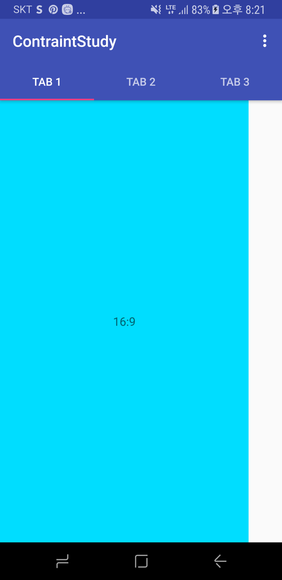
<TextView
    android:id="@+id/w_A"
    android:layout_width="0dp"
    android:layout_height="0dp"
    android:background="@android:color/holo_blue_bright"
    android:gravity="center"
    android:padding="5dp"
    android:text="16:9"
    android:textSize="15sp"
    app:layout_constraintTop_toTopOf="parent"
    app:layout_constraintBottom_toBottomOf="parent"
    app:layout_constraintDimensionRatio="h,16:9" />
app:layout_constraintDimensionRatio="h 혹은 w, width:height"
<TextView
    android:id="@+id/w_A"
    android:layout_width="wrap_content"
    android:layout_height="wrap_content"
    android:background="@android:color/holo_blue_bright"
    android:gravity="center"
    android:padding="5dp"
    android:text="Widget One"
    android:textSize="15sp"
    app:layout_constraintLeft_toLeftOf="parent"
    app:layout_constraintRight_toLeftOf="@+id/w_B" />

<TextView
    android:id="@+id/w_B"
    android:layout_width="wrap_content"
    android:layout_height="wrap_content"
    android:background="@android:color/holo_orange_dark"
    android:gravity="center"
    android:padding="5dp"
    android:text="Widget Two"
    android:textSize="15sp"
    app:layout_constraintLeft_toRightOf="@id/w_A"
    app:layout_constraintRight_toRightOf="parent" />
CHAIN_SPREAD-- the elements will be spread out (default style)
<TextView
    android:id="@+id/w_A"
    android:layout_width="wrap_content"
    android:layout_height="wrap_content"
    android:background="@android:color/holo_blue_bright"
    android:gravity="center"
    android:padding="5dp"
    android:text="Widget One"
    android:textSize="15sp"
    app:layout_constraintLeft_toLeftOf="parent"
    app:layout_constraintRight_toLeftOf="@+id/w_B" />

<TextView
    android:id="@+id/w_B"
    android:layout_width="wrap_content"
    android:layout_height="wrap_content"
    android:background="@android:color/holo_orange_dark"
    android:gravity="center"
    android:padding="5dp"
    android:text="Widget Two"
    android:textSize="15sp"
    app:layout_constraintLeft_toRightOf="@id/w_A"
    app:layout_constraintRight_toLeftOf="@+id/w_C" />

<TextView
    android:id="@+id/w_C"
    android:layout_width="wrap_content"
    android:layout_height="wrap_content"
    android:background="@android:color/holo_purple"
    android:gravity="center"
    android:padding="5dp"
    android:text="Widget Three"
    android:textSize="15sp"
    app:layout_constraintLeft_toRightOf="@id/w_B"
    app:layout_constraintRight_toRightOf="parent" />
- Weighted chain -- in
CHAIN_SPREADmode, if some widgets are set toMATCH_CONSTRAINT, they will split the available space
app:layout_constraintHorizontal_weight="1"
<?xml version="1.0" encoding="utf-8"?>
<android.support.constraint.ConstraintLayout xmlns:android="http://schemas.android.com/apk/res/android"
    xmlns:app="http://schemas.android.com/apk/res-auto"
    android:layout_width="match_parent"
    android:layout_height="match_parent">

    <TextView
        android:id="@+id/w_A"
        android:layout_width="wrap_content"
        android:layout_height="wrap_content"
        android:background="@android:color/holo_blue_bright"
        android:gravity="center"
        android:padding="5dp"
        android:text="Widget One"
        android:textSize="15sp"
        app:layout_constraintLeft_toLeftOf="parent"
        app:layout_constraintRight_toLeftOf="@+id/w_B" />

    <TextView
        android:id="@+id/w_B"
        android:layout_width="0dp"
        android:layout_height="wrap_content"
        android:background="@android:color/holo_orange_dark"
        android:gravity="center"
        android:padding="5dp"
        android:text="Widget Two"
        android:textSize="15sp"
        app:layout_constraintHorizontal_weight="1"
        app:layout_constraintLeft_toRightOf="@id/w_A"
        app:layout_constraintRight_toLeftOf="@+id/w_C" />

    <TextView
        android:id="@+id/w_C"
        android:layout_width="0dp"
        android:layout_height="wrap_content"
        android:background="@android:color/holo_purple"
        android:gravity="center"
        android:padding="5dp"
        android:text="Widget Three"
        android:textSize="15sp"
        app:layout_constraintHorizontal_weight="1"
        app:layout_constraintLeft_toRightOf="@id/w_B"
        app:layout_constraintRight_toRightOf="parent" />

</android.support.constraint.ConstraintLayout>
CHAIN_SPREAD_INSIDE-- similar, but the endpoints of the chain will not be spread out
app:layout_constraintHorizontal_chainStyle=""
app:layout_constraintVertical_chainStyle=""
<TextView
    android:id="@+id/w_A"
    android:layout_width="wrap_content"
    android:layout_height="wrap_content"
    android:background="@android:color/holo_blue_bright"
    android:gravity="center"
    android:padding="5dp"
    android:text="Widget One"
    android:textSize="15sp"
    app:layout_constraintHorizontal_chainStyle="spread_inside"
    app:layout_constraintLeft_toLeftOf="parent"
    app:layout_constraintRight_toLeftOf="@+id/w_B" />
CHAIN_PACKED-- the elements of the chain will be packed together. The horizontal or vertical bias attribute of the child will then affect the positioning of the packed elements
<TextView
    android:id="@+id/w_A"
    android:layout_width="wrap_content"
    android:layout_height="wrap_content"
    android:background="@android:color/holo_blue_bright"
    android:gravity="center"
    android:padding="5dp"
    android:text="Widget One"
    android:textSize="15sp"
    app:layout_constraintHorizontal_chainStyle="packed"
    app:layout_constraintLeft_toLeftOf="parent"
    app:layout_constraintRight_toLeftOf="@+id/w_B" />
<TextView
    android:id="@+id/w_A"
    android:layout_width="wrap_content"
    android:layout_height="wrap_content"
    android:background="@android:color/holo_blue_bright"
    android:gravity="center"
    android:padding="5dp"
    android:text="Widget One"
    android:textSize="15sp"
    app:layout_constraintHorizontal_chainStyle="packed"
    app:layout_constraintHorizontal_bias="0.2"
    app:layout_constraintLeft_toLeftOf="parent"
    app:layout_constraintRight_toLeftOf="@+id/w_B" />
<android.support.constraint.Guideline
    android:id="@+id/guideline1"
    android:layout_width="wrap_content"
    android:layout_height="wrap_content"
    app:layout_constraintGuide_percent=".15" />
<android.support.constraint.Guideline
    android:id="@+id/left_guideline"
    android:layout_width="wrap_content"
    android:layout_height="wrap_content"
    android:orientation="vertical"
    app:layout_constraintGuide_percent=".15" />

<android.support.constraint.Guideline
    android:id="@+id/right_guideline"
    android:layout_width="wrap_content"
    android:layout_height="wrap_content"
    android:orientation="vertical"
    app:layout_constraintGuide_percent=".85" />

<android.support.constraint.Guideline
    android:id="@+id/top_guideline"
    android:layout_width="wrap_content"
    android:layout_height="wrap_content"
    android:orientation="horizontal"
    app:layout_constraintGuide_percent=".15" />

<android.support.constraint.Guideline
    android:id="@+id/bottom_guideline"
    android:layout_width="wrap_content"
    android:layout_height="wrap_content"
    android:orientation="horizontal"
    app:layout_constraintGuide_percent=".85" />

<Button
    android:id="@+id/button"
    android:layout_width="0dp"
    android:layout_height="0dp"
    android:text="Button"
    app:layout_constraintBottom_toBottomOf="@+id/bottom_guideline"
    app:layout_constraintLeft_toLeftOf="@+id/left_guideline"
    app:layout_constraintRight_toRightOf="@+id/right_guideline"
    app:layout_constraintTop_toTopOf="@+id/top_guideline" />
[출처] Android ConstraintLayout 분석|작성자 pistolcaffe
'개발 > 안드로이드' 카테고리의 다른 글
| app:layout_scrollFlags 속성 (0) | 2017.05.31 |
|---|---|
| CollapsingToolbarLayout (0) | 2017.05.31 |
| RxJava, RxAndroid 의 활용 - 1. Retrolambda (0) | 2017.05.30 |
| Retrofit2 + okhttp3 + Rxandroid 사용법 (0) | 2017.05.30 |
| 오픈 소스 라이브러리 쉽게 배포하기 - JitPack (0) | 2017.03.28 |
댓글