LinearLayout이나 RelativeLayout을 쓰다보면 ConstraintLayout을 왜쓰면 좋을지 궁금증을 가지게 됩니다. 저도 그랬고, 새로 학습해야해서 잠깐 미뤄뒀는데, 직접 써보니 이게 왠걸, 정말 재미있는 레이아웃입니다.
ConstraintLayout을 쓰면서 어려웠던 부분 3가지를 설명 드리겠습니다. 제 설명만 들으면 ConstraintLayout 금방쉽게 쓰실 수 있을겁니다.
먼저, 제가 학습하면서 가장 도움이 되었던 출처를 알려드립니다.
가장 먼저, ConstraintLayout을 쓰기 위해서는 단어를 이해하는게 중요합니다.

ConstraintLayout의 배치를 위한 기준값 app:layout_constraintRight_toRightOf="parent" />
app:layout_constraintRight_toRightOf=”parent” 이게 무슨 의미일까요. 저는 처음에 이부분부터 헷갈렸습니다. 여기서 단어뜻의 이해가 매우 중요합니다. button1 right의 constraint를 줄건데, 이건 parent의 right다. 라는 의미입니다. 즉, 아래 레이아웃처럼 parent layout의 오른쪽으로 배치를 할거다라는 의미입니다.

app:layout_constraintRight_toRightOf="parent" 을 설정한 button의 모습
그러면 두번째로 궁금증이 생깁니다. 일렬로 서로 붙어있는 버튼 2개배치하고 싶으면 어떻게 해야할까. 하나의 버튼에는 바로 위처럼 right를 주고, 다른 하나의 버튼에는 left를 설정해주면 될까요? 한번 해보겠습니다.
android:layout_width="match_parent"
android:layout_height="match_parent"
xmlns:app="http://schemas.android.com/apk/res-auto">
android:id="@+id/button1"
android:layout_width="wrap_content"
android:layout_height="wrap_content"
app:layout_constraintRight_toRightOf="parent"/>
android:id="@+id/button2"
android:layout_width="wrap_content"
android:layout_height="wrap_content"
app:layout_constraintLeft_toLeftOf="parent"/>
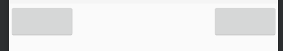
위의 레이아웃으로 코딩했을 때 모습
저렇게 두개의 버튼이 떨어져 보이게 됩니다. 그럼 붙이고 싶은데 어떻게 하면 될까요? 여기서 제가 강조하고 싶은 ConstraintLayout Chain에 대해 설명해드리겠습니다. 참고로 더 정확히 설명되어있는 공식 사이트 알려드릴게요.
Chain의 단어뜻이 중요합니다. 생각하시는 아래와 같은 체인입니다. 서로가 연결되어있는 것이죠. 동그라미 하나가 뷰 하나라고 생각하시면 됩니다.

저는 button1과 button2를 서로 연결하고 싶습니다. 보다 정확히 말하자면 두개의 버튼이 붙어있었으면 좋겠습니다. 그럼 어떻게 해야할까요?
xmlns:app="http://schemas.android.com/apk/res-auto"
android:layout_width="match_parent"
android:layout_height="match_parent">
android:id="@+id/button1"
android:layout_width="wrap_content"
android:layout_height="wrap_content"
app:layout_constraintRight_toRightOf="parent"
app:layout_constraintLeft_toRightOf="@+id/button2" />
android:id="@+id/button2"
android:layout_width="wrap_content"
android:layout_height="wrap_content"
app:layout_constraintLeft_toLeftOf="parent"
app:layout_constraintRight_toLeftOf="@id/button1" />
처음 레이아웃 코드와는 다르게 @id값을 참조하고 있습니다. button1의 왼쪽은 button2의 오른쪽에 있고, button2의 오른쪽은 button1의 왼쪽에 있게 하는 설정값을 준것입니다. 그럼 레이아웃은 어떻게 보일까요?

위의 코드대로 작성한 레이아웃
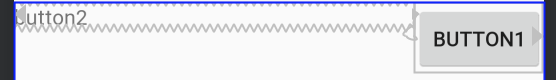
실제 가운데 chain 모양이 보이시나요? button1과 2사이에 제가 첨부했던 chain사진과 같은 모양으로 chain이 설정된것을 볼 수 있습니다. 참 디테일하네요!
저는 근데, 두개의 버튼을 붙이고 싶었습니다. 그러면 의도했던대로 나온 것을 아니네요. 여기서 chainStyle을 알고가셔야 합니다.
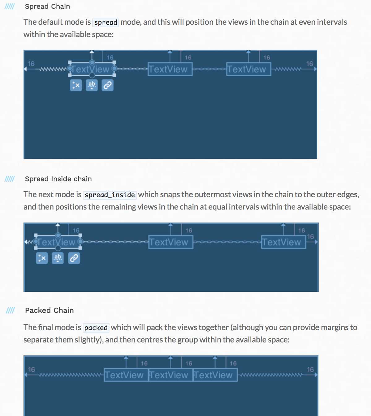
출처: 공식사이트
설명보다 그림이 훨씬 잘 이해되죠? 3가지 종류의 chain이 있는데, 제가 의도한 붙어있는 버튼을 만들고 싶을때는 3번째 그림처럼 Packed Chain 을 사용하면됩니다.
xmlns:app="http://schemas.android.com/apk/res-auto"
android:layout_width="match_parent"
android:layout_height="match_parent">
android:id="@+id/button1"
android:layout_width="wrap_content"
android:layout_height="wrap_content"
android:text="button1"
app:layout_constraintRight_toRightOf="parent"
app:layout_constraintLeft_toRightOf="@+id/button2" />
android:id="@+id/button2"
android:text="button2"
android:layout_width="wrap_content"
android:layout_height="wrap_content"
app:layout_constraintHorizontal_chainStyle="packed"
app:layout_constraintLeft_toLeftOf="parent"
app:layout_constraintRight_toLeftOf="@id/button1" />

위의 코드대로 나타난 레이아웃
오, 이제 두개의 버튼이 붙었네요. 하지만 가운데로 정렬이 되어있네요. 왜냐하면 각 버튼의 왼쪽과 오른쪽이 parent가 기준이 되고 있기 때문입니다. 이때 왼쪽으로 붙여서 쓸수있는 속성을 알려드릴게요.
xmlns:app="http://schemas.android.com/apk/res-auto"
android:layout_width="match_parent"
android:layout_height="match_parent">
android:id="@+id/button1"
android:layout_width="wrap_content"
android:layout_height="wrap_content"
android:text="button1"
app:layout_constraintRight_toRightOf="parent"
app:layout_constraintLeft_toRightOf="@+id/button2" />
android:id="@+id/button2"
android:text="button2"
android:layout_width="wrap_content"
android:layout_height="wrap_content"
app:layout_constraintHorizontal_bias="0"
app:layout_constraintHorizontal_chainStyle="packed"
app:layout_constraintLeft_toLeftOf="parent"
app:layout_constraintRight_toLeftOf="@id/button1" />
app:layout_constraintHorizontal_bias="0" 만 추가하면 됩니다. default값은 0.5입니다. 그것보다 작으면 왼쪽으로, 크면 오른쪽으로 배치가 됩니다.

app:layout_constraintHorizontal_bias=”0"을 설정한 모습
자, 어떠신가요. 기본적인 레이아웃 설정은 확실히 이해가 되셨나요? 그럼 마지막 세번째!!! 제가 진짜 소개하고 싶었던, 제가 2일에 걸쳐 삽질했던 내용을 알려드릴게요. 이거 진짜 꿀팁, 초 핵심부분입니다.
먼저 디자인의 요구사항은 1)왼쪽에 텍스트가 있고, 오른쪽에 이미지가 있는상황, 2) text maxline 은 1줄이고, text가 길어지든 짧아지든 text바로옆에 이미지가 있어야 함/ 예를 들면 아래와 같은 상황이었습니다.(사실 더 복잡했는데, 포인트인 상황만 소개합니다)
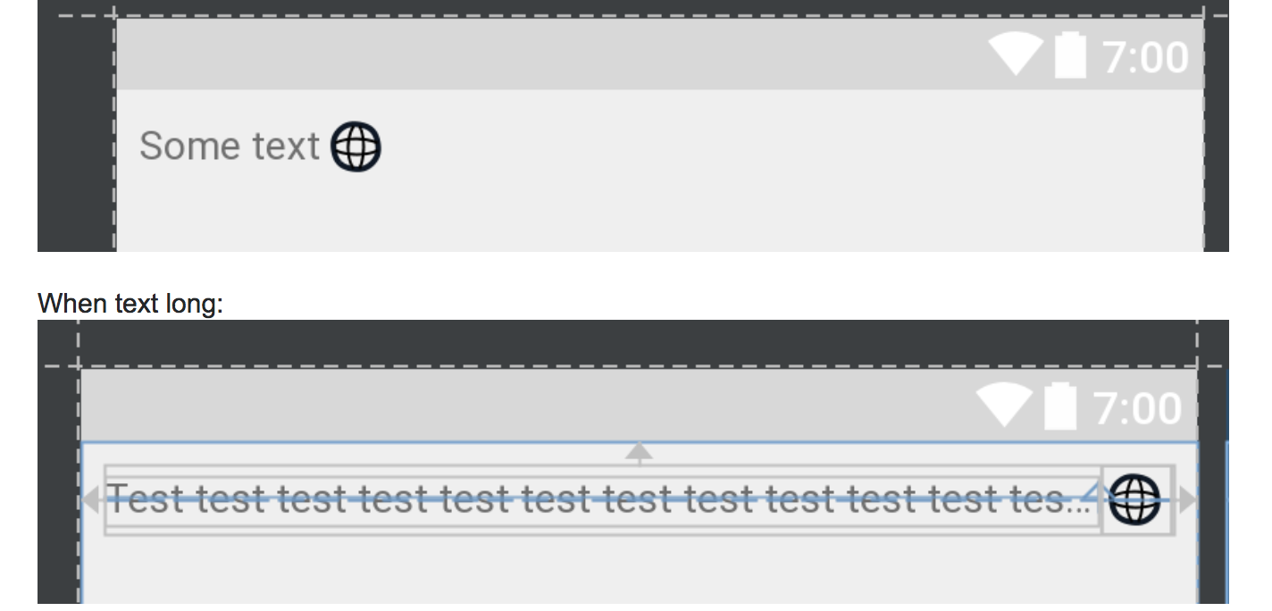
문제를 겪었던 예시상황
사실 이부분은 Linearlayout의 width를 0으로 주고, weight를 설정하는데, 이걸 ConstraintLayout에서는 어떻게 해야할까요? 똑같이 0을 주고 weight를 하면 될까요?
xmlns:app="http://schemas.android.com/apk/res-auto"
android:layout_width="match_parent"
android:layout_height="match_parent">
android:id="@+id/button1"
android:layout_width="wrap_content"
android:layout_height="wrap_content"
android:text="button1"
app:layout_constraintRight_toRightOf="parent"
app:layout_constraintLeft_toRightOf="@+id/button2" />
android:id="@+id/button2"
android:text="button2"
android:layout_width="0dp"
app:layout_constraintHorizontal_weight="1"
android:layout_height="wrap_content"
app:layout_constraintHorizontal_bias="0"
app:layout_constraintHorizontal_chainStyle="packed"
app:layout_constraintLeft_toLeftOf="parent"
app:layout_constraintRight_toLeftOf="@id/button1" />
전혀 제가 의도한 대로 되지 않네요, 텍스트가 짧은데 버튼은 맨 오른쪽에만 가있는 얄미운 상황입니다.
xmlns:app="http://schemas.android.com/apk/res-auto"
android:layout_width="match_parent"
android:layout_height="match_parent">
android:id="@+id/text1"
android:text="button2button2button2button2"
android:layout_width="wrap_content"
android:layout_height="wrap_content"
android:maxLines="1"
app:layout_constrainedWidth="true"
app:layout_constraintHorizontal_weight="1"
app:layout_constraintHorizontal_bias="0"
app:layout_constraintHorizontal_chainStyle="packed"
app:layout_constraintStart_toStartOf="parent"
app:layout_constraintEnd_toStartOf="@id/button1" />
android:id="@+id/button1"
android:layout_width="wrap_content"
android:layout_height="wrap_content"
android:text="button1"
app:layout_constraintEnd_toEndOf="parent"
app:layout_constraintStart_toEndOf="@id/text1" />
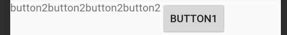
텍스트가 짧아도 오른쪽에 버튼 위치
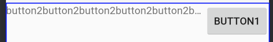
텍스트가 길어도 오른쪽에 버튼이 사라지지 않아요!
width를 0dp로 설정하고 weight를 1로 설정해도 버튼이 계속 사라지는 문제 가있는데, 이걸 android:layout_width=”wrap_content”와 app:layout_constrainedWidth=”true” 으로 해결할 수 있습니다. 사실 여기서 더 중요한건 ConstraintLayout 버전입니다. 꼭 최신 1.1.0으로 업데이트 하세요!! (이전 버전인 경우, layout_constraintWidth_default=”wrap” 을 설정)
ConstraintLayout을 사용해본 후기로, 학습난이도가 꽤 있었다고 생각됩니다. 제가 설명한 속성외에도 정말 다양하게 많거든요. 속성값만 이해해도 충분히 자유자재로 사용하실수 있습니다. 그리고 풍부한 표현식으로 레이아웃의 유연함을 더 높였다고 생각됩니다.
그럼, 다른 레이아웃보다 더 좋을까?에 대한 의문은 제 개인적인 생각보다 다른 참고 사이트를 보시는것도 좋을것 같네요.
제가 2~3일에 걸쳐 삽질하고 학습한 ConstraintLayout 설명을 마치겠습니다. 제 글을 보고 삽질을 줄이셨으면 좋겠습니다. 영어로 된 사이트들의 설명이 제일 잘되어있었지만, 한글로 기본적인 부분을 쉽게 설명해주는 글을 많이 못본것같아 이렇게 글을 쓰게 되었습니다. 혹시 틀린부분 있다면 알려주세요! 그리고 도움되셨다면 하단에 clap 눌러주세요!
'개발 > 안드로이드' 카테고리의 다른 글
| Android Kotlin MVVM패턴으로 간단한 검색 앱 만들기 - 1. BaseView, BaseViewModel을 작성하여 MVVM의 토대 만들기 (0) | 2019.05.31 |
|---|---|
| 안드로이드 컨스트레인트레이아웃. (Android ConstraintLayout) (0) | 2019.05.31 |
| Android Architecture Components - ViewModel (0) | 2019.05.29 |
| Android Architecture Components - LiveData API (0) | 2019.05.29 |
| Android Architecture Components - Handling Lifecycles (0) | 2019.05.28 |


댓글